ShopDreamUp AI ArtDreamUp
Deviation Actions


Description
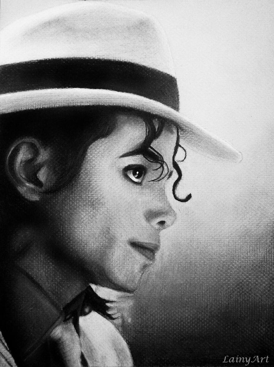
This is an older portrait of mine from 2009- my very first of MJ and it still has a special place in my heart.
>> Chalk and Charcoal on 9x12 off-white textured paper. White acrylic paint for highlights. Finished in about 35 hours.
Available for stretched canvas prints at LainyArt Etsy [link]
 Info: [link]
Twitter:[link]
Facebook:[link]
Tumblr:[link]
Etsy:[link]
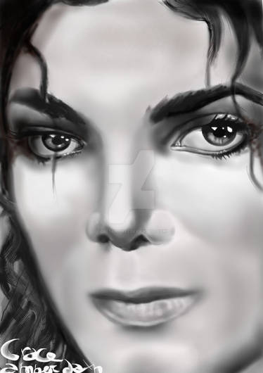
More Work you may like:


>> Chalk and Charcoal on 9x12 off-white textured paper. White acrylic paint for highlights. Finished in about 35 hours.
Available for stretched canvas prints at LainyArt Etsy [link]
Info: [link]Twitter:[link]
Facebook:[link]
Tumblr:[link]
Etsy:[link]
More Work you may like:
Image size
1000x1335px 370.9 KB
© 2009 - 2024 secrets-of-the-pen
Comments133
Join the community to add your comment. Already a deviant? Log In
Here is the critique you requested from #Traditional-Media. This is a really nice portrait - the features are well placed, the structure of the skull is solid, and the treatment of both is subtle and lovely. That ear is beautiful - it’s exact, yet fades away into the darkness of the hair, letting the viewer focus on the eye. You’ve really used contrasting values to your advantage, reserving the highest contrast and the lightest light for the most important part. That being said, I think it’s the periphery elements which could use some improvement - the hair falling in front of his eyes, his neck and collar, and the hair behind his neck, to be specific. In both instances, the hair can be softer along the outer edges, and the hair right in front of the eye can be more wispy, finer, and more loosely rendered as it ends. I do realize he often gelled his hair into tight, specific ringlets, but for the sake of the overall effect of the drawing, which displays beautiful softness in the face, it would be better to have the hair softer. The neck looks too soft in the middle, and too hard on its edge - pick out a little sharp detail (maybe in a tendon?) in the neck, and fuzz out the edge against the dark dark hair. Also, it feels like the paper could be cropped a bit to the right, with the brim of his hat almost touching the paper's edge. Wow, I’m being specific, but it’s on account of the nice overall effect of this piece!